7 Key Features of a Lead-Generating Website
In the digital age, your website isn’t just a website. It is a valuable business tool that turns prospects into customers. Or, at least, it can be if it has the right components.
When it comes to driving traffic to your site, there are many ways to do it. However, unless your website is converting visitors into leads, you are leaving money on the table. Not to mention the money you waste on ineffective paid promotions and campaigns. This is why having a website set up for lead generation is so important.
Consider the current state of your site for a moment. Does it compel visitors to take action? Is it capturing the information of prospective customers effectively? Does it represent your company as a legitimate and trustworthy business? Your website may be teeming with opportunities to drastically increase conversions.
To help you leverage those opportunities, here’s a list of common components found on sites that generate leads.
1. User-Friendly, Action-Oriented Design
The purpose of most web properties is to guide visitors toward taking a certain action. When your site is intuitive, attractive and easy to navigate, you are going to generate more leads. And everything counts – fonts, colours and calls to action, and even whitespace.
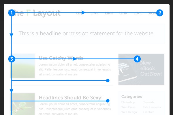
Layout is an imperative web design factor. Ideally, you always want the attention of your visitors on the lead-generating sections of your pages. A highly cited 2006 Nielsen Group study indicates that users read web content from top to bottom in an F-pattern. Placing CTAs within this pattern could be a great way to up conversion rates.
Here’s an example by Envato Studio of a business website following the F-pattern layout.
2. Pages That Call to Action
People generally visit websites with the intention of taking an action. A lot of the time, they know what they are there to do but in many cases, they don’t. They are simply there to browse. With well-placed, compelling calls to action on each page, you can help visitors find what they want and move further down the buying funnel.
Creating multiple CTAs will make it easier to funnel prospects through your buying process. You also will want to add a primary call to action on every page as your CTA baseline. It should call for the most important action you would like visitors to take. See our guide to writing an effective call to action.
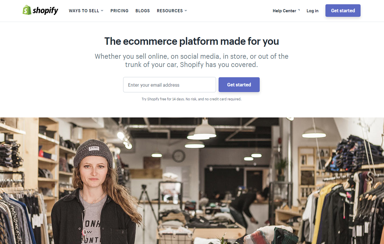
As an example, this CTA on the Shopify homepage makes signing up easy and attractive.

3. Lead Gen Forms
To generate leads, you need lead generation forms. How else will your visitors opt-in to provide their email, phone number and other particulars? And pay attention to the “opt-in” part; with lead gen forms, the focus is targeted prospects actively expressing an interest in your business and products by voluntarily entering their information.
When you embed led generation forms on your website and landing pages, you are providing a quick and easy way through which visitors can convert into leads. How long should the forms be? That depends on your goals. Short forms generally attract more inquiries. However, longer forms may attract higher quality leads.
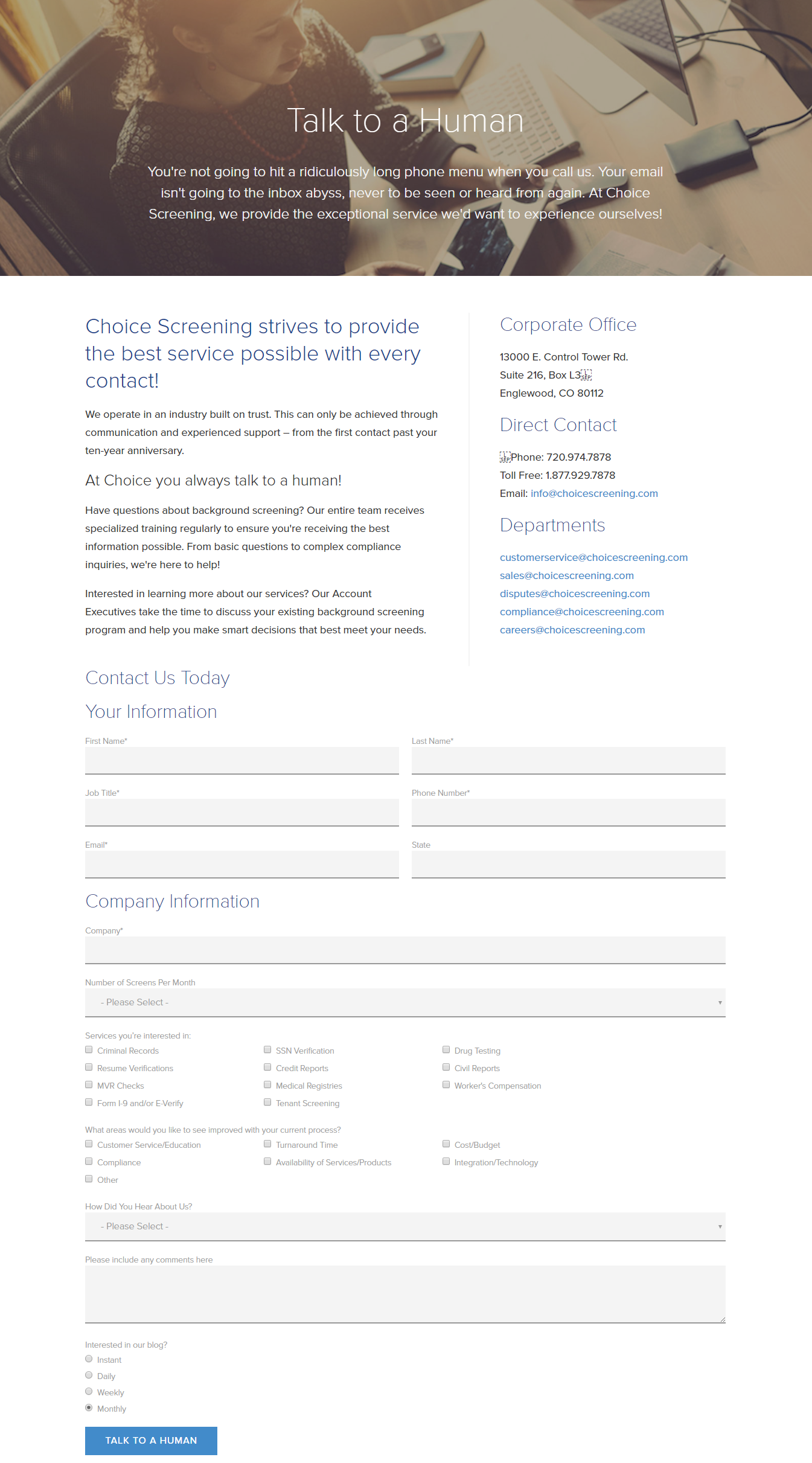
In the example below, the long form on the ChoiceScreening “Contact Us” page is functional and appropriate.

4. Custom Landing Pages
Landing pages go hand in hand with lead gen forms and are equally important. In fact, if you want more leads, every offer created for your business should tie up to a customised landing page with copy that spurs visitors into action. The more landing pages, the better, as SEO gets a boost and you’ll have more opportunities to convert.
Copy and text aside, there are many elements that can affect conversion rates with landing pages. Design, navigation, length, images and sharability are just a few of these. Fortunately, there are also many software tools that make it easy to create high-conversion pages.
 |
Do you want to know how to apply these principles and more to generate more leads from your online marketing? Learn with our ebook “The 30 Greatest Lead Generation Tips, Tricks & Ideas!” |
5. Pop-ups
That’s right, pop-up forms. Despite all the doubt and controversy surrounding them, pop-ups workwhen used correctly. For popups to be effective, they need to offer something of value. Also, they must appear at just the right time. Additionally, it’s important to use actionable language that resonates with customers.
Other factors that affect lead generation with pop-up forms include form type (such as banners, modal overlays and welcome mats) and web page placement, as placing the wrong ads on the wrong pages can have negative effects. The trick, ultimately, is to deploy pop-ups in a manner that enriches user experience.
Here’s an example of a pop-up that works – an overlay style scroll popup by Convince&Convert.

6. An Active Business Blog (with Compelling CTAs)
Does your website have a blog? Is it updated regularly? If not, you’re losing money. A business blog can attract masses of valuable traffic and leads. Every blog that you post is an opportunity to generate business. Because the traffic is targeted, your chances of converting visitors are high.
Blogging for business can be extremely beneficial. To reap the benefits, though, your content should offer real value and every post published for your company should include a strong call-to-action – one or more CTAs that point to an enticing landing page and offer.
7. Trust Symbols & Social Proof
Visitors become leads when they enter personal details such as their name, email address and/or business particulars on your website pages, but most people will only provide that coveted information if they know and trust your business.
One of the best ways to establish trust on your web pages is by posting case studies and testimonials. Recommendations by other customers can significantly improve conversion rates. Other social proof elements known to boost conversions include trust seals and client logos, as these reassure visitors that their info is secure.
Here are a few commonly used trust seals.
So there it is – seven key components of a lead-generating website.Which other features make up the anatomy of a website that generates leads? Tell us in the comments section below.

Marketing Communications Manager
Author Bio: Anastasia Lambadaridis Heggie is the Marketing Communications Manager at Melbourne based digital marketing agency BizWisdom. Anastasia is passionate about creating unique brand experiences and gold standard campaigns that drive behavioral change and ROI. In this fast paced digital age, Anastasia aims to add back the ‘human touch’ in our interactions and connections. Anastasia holds a Bachelor of Commerce and Applied Science, and innately understands social norms and emotional triggers that drive and impact consumer behavior. Anastasia also runs Melbourne’s ecofriendly beauty brand, save our skin and uses these natural products as a vehicle to promote social change and healthy living.


