Delight Your Users and Drive Conversions With Mobile Site Design
The reliance on mobile devices to research products, find a service and make purchases is ever increasing, so having an effective mobile site is extremely important to the success of your business.
Mobile browsing behaviour tends to be rich in intent, very goal focused and time sensitive. Often mobile users have an immediate need so keeping their goals in mind when designing your mobile pages is key to your success in the ‘mobile-first’ world we now live in.
So what does it take to create a mobile experience that will delight your visitors and drive conversions? Below is a list of some of the most important aspects in design to consider when building your site.
Clean Homepage Design
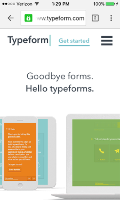
Use the real estate on your homepage to get mobile users the information they need quickly. Keep the design uncluttered and ordered. Use images and icons sparingly.
A study by Google determined that fewer images on a mobile site actually increases more conversions.
Calls-To-Action Upfront
Keep your CTA’s upfront and visible above the fold. Allow users to complete their goals as quickly as possible.
Compact Menus
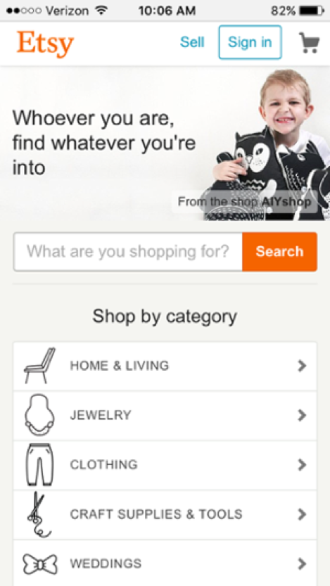
Use the mobile screen wisely, keep your mobile menus compact and quick to use. Consider using categories to minimise the screen real estate used in the menu.
Navigate Quickly
Use breadcrumb navigation links to allow the user to move back through your content hierarchy with ease.
Visible Site Search
Implement a visible search feature with relevant results, include filters if possible.
Avoid Multiple Pages
Keep your user’s browsing experience in one page, navigating multiple pages or tabs on mobile is difficult and frustrating.
Purchase Now, Register Later
Allow users to purchase as a guest, and register for an account later in the checkout process. Reduce the roadblocks to purchase.{shopping cart video here}
Complete on Another Device
Use a ‘Persistent Shopping Cart’ feature in your ecommerce store to allow users to complete their purchase on another device, as they may be just researching on the run and may like to resume their journey later. Consider implementing a ‘Save for Later’ button that emails a link to the user.
Do you want to know how to apply these principles and more to generate more leads from your online marketing? Learn with our ebook “The 30 Greatest Lead Generation Tips, Tricks & Ideas!”
Quick & Simple Form Entry
Use number pads and automatic advancement through fields. Use large tap targets in multiple choice fields, avoid small form elements that make the user zoom in on the page. Use a calendar for dates, use real-time validation so a user can correct the information on the fly before submitting the form and pre-fill form data as much as possible.
Optimise Page Load Speed
Lightning fast load speeds is one of the most critical factors to success in mobile browsing. Use caching plugins and content delivery networks for your images and scripts, and move your non-critical scripts to the bottom of the page.
Creating a user experience that’s fast, elegant and helpful will go a long way to building your brand and driving conversions, not only will Google reward you but your customers will thank you with their business.
David Connelly
Paid Media Specialist
Author Bio: David Connelly is a passionate digital marketer with a wealth of experience in Pay Per Click management. David heads up the Paid Media team at BizWisdom and is driven by creating huge value for his clients in Search, Social and beyond.
Download your free eBook: 30 Greatest Lead generation Tips, Tricks & Ideas


